I spent almost the whole day Saturday with family, but when I finally got around to working on Sholpan, I breezed through almost 10k words in only a couple hours. Granted, it was mostly light revision and the material was fairly well polished to begin with, but still…it was just fun.
The best part of writing this novella has been rediscovering Stella’s story from Bringing Stella Home. At first, I was a little worried that it might be a bit too shocking (and for some of my friends, it probably is), but there’s a lot of depth to the story, and the content, while definitely mature, is never gratuitous.
The story is basically about an innocent, sexually inexperienced young woman who struggles to keep her virtue and self-respect intact within the harem of the brutal space barbarians who have enslaved her. While she starts from a position of almost total powerlessness, she finds ways to leverage herself without completely compromising her values.
I haven’t figure out the blurb yet, but that’s a pretty accurate description of the story. It’s basically all of the scenes in Bringing Stella Home from Stella’s viewpoint, up through the first and second acts of the book. In the third act, everything comes to a head, and…well, I won’t ruin it for you. 😉
I’ll probably finish Sholpan sometime later today. My copy editor for Bringing Stella Home should be sending back the manuscript with his edits tonight, and I’ll spend the rest of the week going through and getting it ready for publication. By Monday, it should be up!
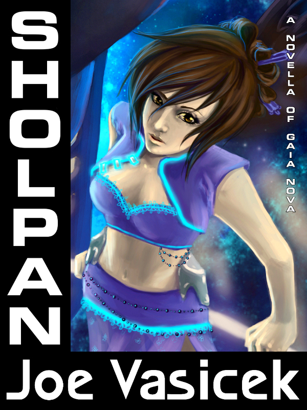
In the meantime, check this out: I was playing with the cover art yesterday afternoon, and came up with a cover for Sholpan. What do you think?
The thumbnail:
…and the full sized image:
Man, this is so much fun!


Isn’t that the image you were going to use for your Bringing Stella Home cover? I don’t really like how a whole lot of the image is missing now… It feels cramped.
And I’m not a fan of the text, or the text layout, to be honest… And it feels like the image is stretched left to right a bit?
Sorry, this is all criticism. =P
I do think having a novella to go along with your novel is a cool idea, though.
It is, though it’s cropped significantly to show that the work itself is different. That’s a big question I have, actually: for spinoff works like novellas and short stories, is it better to reuse the original novel cover art, or to commission completely new art? Laying aside the question of which is more expensive (clearly reusing the art), by having the novel cover and the spinoff cover look similar, it signals to people that the content is also similar. I don’t want people to pick up the novella and feel ripped off because they feel like it’s something they’ve already read.
As for the other criticisms, I wonder if the problem isn’t that you’re seeing it as a full size cover image. What would you think of the image if used as a thumbnail? I’ll upload it into the post so that you can see.
Okay, if that’s what you’re going for then I understand, though I personally think a new cover would be best. Then perhaps have the title be something like “Sholpan” at the top with “A Companion Novella to Bringing Stella Home” just underneath. That would be more clear than “A Novella of Gaia Nova,” which I don’t really follow.
I think using the same cover image could confuse some people, even if it is cropped a bit. Perhaps a second drawing of this character by the same artist would be enough to show people that it goes along with your novel, but isn’t the same story. (Of course, that would require more money, which is always an important consideration for these things.)
The thumbnail doesn’t look any different from me, so it might just be me thinking the pic looks slightly stretched.
I think the stretching is coming from the difference in aspect ratio: the original cover art is 2:3, while this is 3:4.
And yeah, I may end up looking into commissioning something new from the artist. If nothing else, it would make a cool interior illustration for the novel. 😛
Also, isn’t the protagonist of Bringing Stella Home the boy, Jim McCoy? Random idea to throw out: Perhaps have the cover for Bringing Stella Home be a picture of him, and just use the original cover image of Stella here for the Sholpan novelette. Perhaps the Bringing Stella Home cover could have him leaning against the rail of his own space ship, looking toward the left (his right), for a “mirror image” type of dealie.
Maybe…I’ll have to think about that.
I was drawn in by the artwork and it makes me curious about the book. I like the larger image because it let me see the details that went into the picture. It is something that would catch my eye. Nice job.